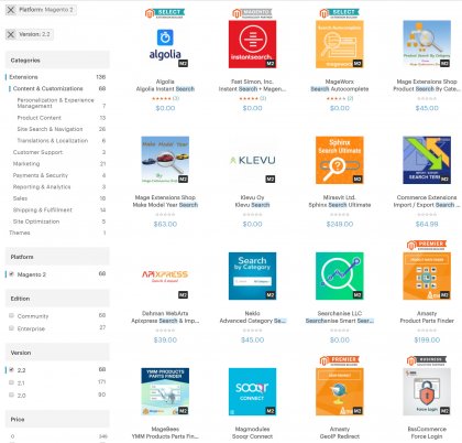
In July 2017, Magento 1 and 2 users received a new version of the company’s official extension store, the Magento Marketplace. The newly launched web store, offering tools, solutions and platforms to build a successful eCommerce business, feels fresh and updated, but let’s see exactly what improvements and new functionalities have been introduced and why so many are excited about these changes.
Design and UX
First of all, let’s talk about what the new Magento Marketplace looks like and how it easy it is to use. One of the main purposes of this relaunch seems to be related to improving the user experience. Judging from reviews and comments on social media of people using the new Magento Marketplace, the new extension store is much more usable than the previous version. It feels lighter and it might even be faster, but the strongest impression is that the design itself, the esthetics of the store, have been retouched in a way that improve the UX greatly.

The layout of the page itself feels more organic and natural, probably because it was actually made to appear more traditional. This does not go to say the page looks rudimentary or dated – it is actually very contemporary, but without all the unnecessary bells and whistles. The page is cleaner, neater, somewhat minimalistic, and therefore more pleasant to use and browse.
Some known user experience issues have been resolved as well – for instance, it is now easier to figure out whether an extension is meant to be used with Magento 1 or 2. Those who have already used the Magento Marketplace will notice that the new page doesn’t have as many featured products as before – those have been scaled back. On the other hand, there are some new additions to the page, such as merchant testimonials, for instance.
What’s Underneath
Let’s see what core changes have been made to the new Magento Marketplace, under the hood, so to speak. The site is based on Magento 2 Cloud Edition, a decision that definitely brought significant benefits. Most importantly, this particular Magento edition allows your site to work hard around the clock, allowing for continuous delivery practices.
It also allows you to scale things up and down and generally brings better flexibility. Cloud Edition comes with Fastly and Varnish, which means advanced caching, among other things. Thanks to these functionalities, as well as the HTTP2 protocol and New Relic, performance monitoring and management has improved.
It is also important to note that with the new Magento Marketplace, product search and filtering are faster, courtesy of Algolia, currently one of the fastest search-building platforms around.
There is one tiny caveat here though: it appears that the primary search feature on small devices (i.e. smartphones) is either buggy or completely missing.
It’s not that the site is not mobile friendly or responsive – on the contrary, the approach used for developing it was mobile-first. But they used two stylesheets, and one of them can only load on larger hand-held devices, such as tablets and smartphones with larger displays.
Some changes have been made to the extension details page as well. For instance, you can do a full screen zoom like the one used in Magento 2. If you have any questions, there is a Q&A page on the bottom, available thanks to a new integration with Bazaar Voice.
After you have browsed the home page and extension detail pages, you can proceed to check-out, with an integrated Single Sign-on process for faster and smoother purchasing. Now would be a good time to pause and comment on how these small, simple improvements make the overall user experience way better.
As for payment, you can choose between PayPal and debit or credit card. Payments are processed through an integration with Braintree in core Magento 2.
Performance
To get even deeper under the hood (but not too deep, don’t worry), we have to say we have some performance concerns. For instance, there simply seems to be too much Javascript. Very large portion of requests on the page address Javascript assets, making the page somewhat heavy. In fact, after testing the page with Google PageSpeed, we saw some poor to average results. Obviously, this needs to be improved and we are certain that the developers will take this issue seriously in future reworks of the Magento Marketplace. While they’re at it, we hope they won’t forget the small device mobile version issue mentioned earlier.

As you can see, the Magento Marketplace includes a number of integrations and seems to have involved a number of external partners. No issues here, of course, the more the merrier, especially when partnering up with others leads to better, speedier and more efficient products. Magento could be a tad more transparent about this, though, as it is not clear whether teams like Aheadworks, Wagento, Wdevs, Softserve, Classy Llama, to name just a few, are brand new for this version of Magento Marketplace or whether they have worked on the previous site version as well.
The Magento Marketplace, improved, slightly revamped and updated as it is, is actually an excellent example of what you, a merchant, can do with the Magento e-commerce platform. This means that the developers did a good job and even though some improvements are missing and there is still work to be done in the next version, they are definitely on the right track. Some might say that the new Magento Marketplace is in no way a serious makeover of any sort, but, did it really need a huge makeover in the first place? And, let’s not forget that Magento will now be making more money selling extensions, meaning more funds to do even better things in all areas of platform development.

